Convert a double-entry table using Storyline

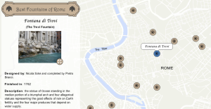
Imagine that you need to include a large double-entry table in your e-learning course, but you want to avoid scrolling up and down. You can convert this type of chart into an interactive double-tab navigation table in 4 simple steps using Storyline.

Double-entrytable

  1. Set up tabs for rows and columns. Each tab should have at least three states: Normal, Hover and Selected. Make sure each group of tabs is a Button set.
  2. Create as many layers as cells the table contents. Label each layer to avoid confusion when adding the triggers.
  3. Add triggers: “Show layer A-1 when user clicks Tab A and Shape 1 is equal to Selected” and the other way back: “Show layer A-1 when user clicks Tab 1 if Shape A is equal to Selected”
  4. Copy and paste the triggers to each combination of tabs.
Click on the image to see the result Essentialvitmins

Check out another example of double-tab navigation in this post

Double-tab navigation: Colored sand beaches

The Idea:

It was 2006, in those days social networks were not as popular as they are now, and people used to forward emails through large mailing lists. One day I received a PowerPoint about the colored sand beaches around the world and I was so amazed by the pictures it contained, that I saved it in my Documents folder.

A couple of months ago, cleaning up the folder, I realized I had kept that Powerpoint all that time, and decided to convert it into something more interactive. Click on the image to see the result:

coloredsandbeaches

The Research:

Searching on the web, I found lots of pictures, videos and articles about the coloured sand beaches. All images included are under Creative Commons licence; in total, almost 40 pictures and 4 videos were included. In the web of the University of Georgia, I found a sample image collection of sand from around the world. I picked the most representative samples, those from the beaches that I had written about.

Most of the information is from blog Sand Atlas and from the U.S. Geological Survey. Check the rest of the sources on the Credits section.

The Design: rounded tabs, borders and buttons!

Using basic shapes, I gave every element in this demo a rounded style. Top tabs are ovals that grow double the size when they’re selected and Bottom tabs are simply two overlapped ovals.

To create the double-tab interaction, I needed 50 layers and 20 triggers! And 12 T/F variables for the customized Menu. Enjoy!

Labelled interactive image: Las Meninas

meninas2A couple of years ago, when visiting Museo del Prado in Madrid, I was amazed by one of the masterpieces of the Spanish painter Diego Velázquez. Back at home, I created a labelled image with a free software called Images Actives.

Unfortunately, this freeware hasn’t been updated since 2011, and this week when I tried to revamp the first version of the file, I got some bugs especially when zooming the image details.

For this new version of the labelled image, I used Storyline. I set up one scene linked to a Spanish and English description, using the information of Wikipedia in both languages. And I added a simple drag-n-drop interaction activity.                                                                                                      Click on the image to launch demo

Today museums  are exploring digital technologies to enhance the visitor experience. Labelled images have a great potential to make it more interactive and immersive; offering a visual description of the works of art that can be seen in museums and galleries.

Interactive map: 12 Best fountains of Rome

FountainsI used to teach Geography, so I love maps and everything related to cartography and spatial representation of data. Maps are used throughout all the sciences and in virtually every aspect of our day-to-day life.

When I heard Weekly Challenge number 86 was about interactive maps for e-learning, I thought it was the perfect opportunity to create a thematic map. The week of  Challenge 86, I was on holidays in Rome, and besides the ancient monuments you can visit in this beautiful city; I was impressed by the large quantity of water fountains you can find everywhere. so I selected 12 of which I consider are the most spectacular fountains, and located on a map. Although this is a personal selection, I think you might agree with me in most of them.

All information about the fountains is based on Wikkipedia-List of fountains in Rome. Some images are licenced under Creative Commons, others are public domain. The ribbon used for the title is from FreePik.

This demo is also available in Spanish

Image Gallery: Compare different types of lettuce

Weekly Challenge nº84 was about creating an example of Image slider or Photo gallery. My first idea was to build a slideshow, because I wanted the images to stand out, and slideshows and carrousels are visual design patterns which instantly grab user’s attention with images.

I decided to present the most common types of leafy lettuce; I had the pictures and descriptions, but (after many attempts) I couldn’t rotate the scrolling panel into a horizontal position. There are some videos explaining how to do that, but I had 14 pics to include and found it difficult rotating them all together; I got some errors and images didn’t scroll smoothly. So I ended up building an interactive presentation with buttons, the effect is similar, and it works fine.

Click on the image below to viewLettuces the presentation.

Hope Storyline adds the option of horizontal scrollbar in future updates 😉


Types of Graphics used in e-learning

It is almost impossible today to imagine an e-learning course without any media file. Images, graphics, videos, animations, diagrams, etc., they’re all an essential part of the content, they complement the text; and support the learning experience.

Researchers have found that users closely attend to images that are relevant to their tasks, but they rarely pay attention to pictures which serve no purpose other than fill screen space within the interface.  For that reason, we should be aware of the type of graphics contained in our course design.

Reading the book “e-Learning and the Science of Instruction” I found the Multimedia Principle extremely useful to relate the type of media with the learning purpose, the chart below sums up the concepts explained by the authors.

Graphic_types

It is extremely important we choose the appropriate media files for the courses we design, we should make sure the images, graphics, animations, or videos; contain information to help the learner to perform the task. Otherwise, they could be distracting and slow down the learning experience.

References:

Clark and Mayer (2011) “e-Learning and the Science of Instruction” 

Mayer, R. Principles for Multimedia Learning

Read more:

Shift e-Learning “Graphics for e-Learning: Which one should I use?”

Interactive Slider #52

One of the new features of Storyline 2 is the option to add interactive sliders. Even though this buit-in feature is not available in Storyline 1, I decided to participate in the weekly Challenge #52 Using Interactive Sliders in e-Learning.

I chose a simple example, the sequence of a bird flight; but never imagined how difficult it was to build that simple interaction in SL1. I could not have done it without the support of a community member, who kindly offered his template and helped me indicating how to deal with the triggers. Thank you e-Learning Locker.

You can see the result clicking on the image below. It took 18 objects and lots of triggers to create that simple animation. In conclusion, until I can upgrade to Storyline 2, I’ll search for other alternatives to an interactive slider.Bird-flight