Meet the Team: examples for introducing people

Inspired by some good examples I found in the amazing community E-learning Heroes, I decided to build four examples for introducing members of a team.

For the first slide “Team Picture”, I replicated the example Create a snapshot focus effect by Linda Lor.

The second slide “Organizational Chart” can be used to show hierarchy within a company. This could be a good resource for a new employee induction course; every picture includes a short welcome message.

Click on the image to launch presentation

I basically got fun with the slide “Sport Team”.  The focus for this sample is to emphasize player’s positions.  I could have chosen any sport, but I realised having less than 7 players, it was easier to arrange the pictures on the playing field.

Last slide TV Channel can be used to give a quick overview of the different teams or departments in a company. For building this example, I combined two great ideas: The collage image by Tom Kuhlmann and Tabs interaction-meet the team by Montse Anderson.

Images are public from Photl.com and all names contained are fictional and included as example only.

Let’s meet the teams!


User Interface Design Patterns

When taking the course “UI Design Patterns” I learnt the basic patterns used for interfaces design. At the same time, I’m learning how to build e-learning content with Articulate Storyline, so I thought it would be a good idea to merge the design theory with the practice of the authoring tool.

Interface patterns can be grouped in different categories, depending on their function: for organizing content, for navigating, for structure the page, for getting input from the user, etc.

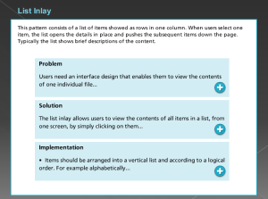
I made a presentation with five patterns used for organizing content:

  • Two-panel selector
  • Navigation tabs
  • List inlay
  • Slideshows
  • Hub and spoke

Although they were originally designed for websites,
they can also be applied in Articulate’ slides.

Click on the image

UI_Design_Patterns


I’m aware the aesthetics might be better (I’m still not expert ;)),

but I focused on each pattern’s implementation.

Hope you find this topic as interesting as I do.

User Interface Design Guidelines

Interface_Design_Guidelines

In the nineties, two well-known usability experts established a list of user interface design principles. Ben Schneidermann posit “Eight Golden rules of User Interface Design”, while Jakob Nielsen published “Ten Usability Heuristics for User Interface Design”.

There are some overlaps between Schneidermann’s and Nielsen’s recommendations.

Click on the image to see some examples

Although more than 30 years have passed, these rules are still taken into consideration to design user interfaces and to carry out usability evaluations.