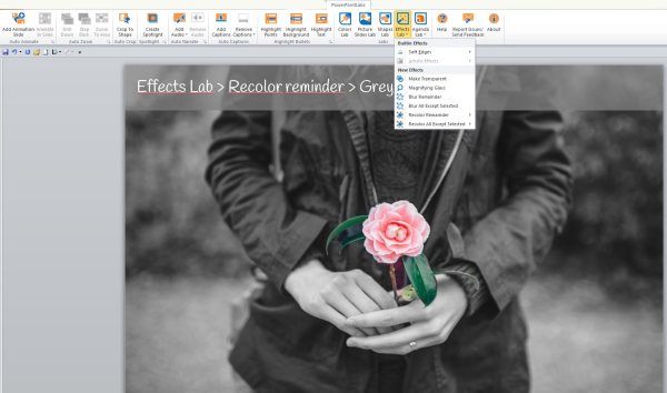
PowerPointLabs add-in

Using this free PowerPoint add-in, you can save time creating image effects and animations without effort. It includes more than 20 built-in features in the menu, not only for image edition but also for creating audio narrations, animations with motion paths, spotlights and highlighted text among others.

I found it particularly useful the options to cut out an image, and to stand out an element of the image, like a magnifying glass, or to blur the background.  The auto-animate option creates motion paths between shapes, which don’t work well when the slide is imported into Storyline.

If you use PowerPoint I recommend you to check it out this free add-in. Below, some of the slides I created using this tool:

PowerPointLabs4web

Double-tab navigation: Colored sand beaches

The Idea:

It was 2006, in those days social networks were not as popular as they are now, and people used to forward emails through large mailing lists. One day I received a PowerPoint about the colored sand beaches around the world and I was so amazed by the pictures it contained, that I saved it in my Documents folder.

A couple of months ago, cleaning up the folder, I realized I had kept that Powerpoint all that time, and decided to convert it into something more interactive. Click on the image to see the result:

coloredsandbeaches

The Research:

Searching on the web, I found lots of pictures, videos and articles about the coloured sand beaches. All images included are under Creative Commons licence; in total, almost 40 pictures and 4 videos were included. In the web of the University of Georgia, I found a sample image collection of sand from around the world. I picked the most representative samples, those from the beaches that I had written about.

Most of the information is from blog Sand Atlas and from the U.S. Geological Survey. Check the rest of the sources on the Credits section.

The Design: rounded tabs, borders and buttons!

Using basic shapes, I gave every element in this demo a rounded style. Top tabs are ovals that grow double the size when they’re selected and Bottom tabs are simply two overlapped ovals.

To create the double-tab interaction, I needed 50 layers and 20 triggers! And 12 T/F variables for the customized Menu. Enjoy!

Labelled interactive image: Las Meninas

meninas2A couple of years ago, when visiting Museo del Prado in Madrid, I was amazed by one of the masterpieces of the Spanish painter Diego Velázquez. Back at home, I created a labelled image with a free software called Images Actives.

Unfortunately, this freeware hasn’t been updated since 2011, and this week when I tried to revamp the first version of the file, I got some bugs especially when zooming the image details.

For this new version of the labelled image, I used Storyline. I set up one scene linked to a Spanish and English description, using the information of Wikipedia in both languages. And I added a simple drag-n-drop interaction activity.                                                                                                      Click on the image to launch demo

Today museums  are exploring digital technologies to enhance the visitor experience. Labelled images have a great potential to make it more interactive and immersive; offering a visual description of the works of art that can be seen in museums and galleries.

How I revamped the Call Center demo

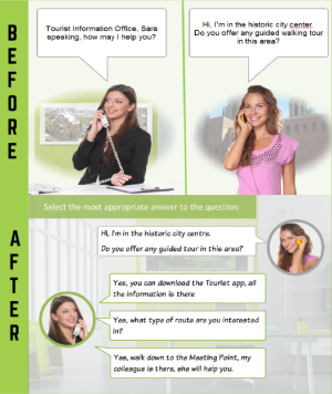
This file, my first branching scenario, was created almost one year ago for the Weekly Challenge #47. Although I was happy with the result, with time I realised that having no audio, users were forced to focus on dialogs and characters expressions at the same time, overloading their visual channel. This condition is better known as The Redundancy Principle.

I decided to improve this scenario by applying Allen’s CCAF model:TouristOffice-BeforeAfter

The Context: Sara working at the Tourist Information Office of Barcelona

The Challenge: helping Sara by answering phone calls on her first day on the job.

The Activity: applying phone etiquettes and providing accurate information in different calls.

The Feedback: the learner receives instant feedback on every choice, and at the end the activity, a graded score and the tourist’ comment from the “Quality survey”.

Click on the image to launch the new version

What I decided to preserve:

  • The characters
  • The colour palette
  • The basic information about the tours in the city of Barcelona

What I modified:

  • The fonts
  • The layout: cleaner, more focused on the activity than on the character’s details and poses.

What I added:

  • Objectives and Guidelines for this Module
  • Custom navigation buttons and Menu
  • Three Number variables to track the learner’s progress

It is highly likely that when another year has passed, I’ll rework the demo again, but this is the best way to learn, don’t you think?


Learn how to build a custom navigation player in Storyline

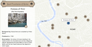
Interactive map: 12 Best fountains of Rome

FountainsI used to teach Geography, so I love maps and everything related to cartography and spatial representation of data. Maps are used throughout all the sciences and in virtually every aspect of our day-to-day life.

When I heard Weekly Challenge number 86 was about interactive maps for e-learning, I thought it was the perfect opportunity to create a thematic map. The week of  Challenge 86, I was on holidays in Rome, and besides the ancient monuments you can visit in this beautiful city; I was impressed by the large quantity of water fountains you can find everywhere. so I selected 12 of which I consider are the most spectacular fountains, and located on a map. Although this is a personal selection, I think you might agree with me in most of them.

All information about the fountains is based on Wikkipedia-List of fountains in Rome. Some images are licenced under Creative Commons, others are public domain. The ribbon used for the title is from FreePik.

This demo is also available in Spanish

Branching scenario: What kind of Leader are you?

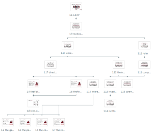
This time I decided to build my first branching scenario. Reading the posts of The Rapid elearning blog, I learned about the power of scenarios: this model allows learners to make decisions as in real world, each choice leads to a consequence and feedback, engaging  learners by pulling out the information they need.

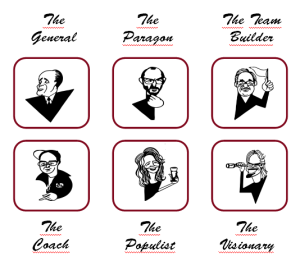
The idea of Challenge number 23leaders-scenariowas to transform a static infographic about the leadership styles into a branching scenario. By having all the choices from the infographic; it was easier to assemble the slides and to create the flow.

I decided to use silhouettes in a dark red colour, to represent the leadership concept, and kept the same colour consistently thoughout all the scene for buttons and titles.  However, in the final slide, where the kind of leader is revealed, I wanted the user to understand there were different type of leaders, so I set up a True/Falsevariable for each leader, and added a final slide where the learner can compare the main values of each leader.leaders

Click on the image above to launch the questionnaire.

I had great time building this scenario, it was fun and I practised with variables and triggers. Using Illustrator, I vectorized the comic images, so they look more clean and the style match better with the silhouettes. I’m the Coach, what kind of leader are you?

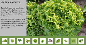
Image Gallery: Compare different types of lettuce

Weekly Challenge nº84 was about creating an example of Image slider or Photo gallery. My first idea was to build a slideshow, because I wanted the images to stand out, and slideshows and carrousels are visual design patterns which instantly grab user’s attention with images.

I decided to present the most common types of leafy lettuce; I had the pictures and descriptions, but (after many attempts) I couldn’t rotate the scrolling panel into a horizontal position. There are some videos explaining how to do that, but I had 14 pics to include and found it difficult rotating them all together; I got some errors and images didn’t scroll smoothly. So I ended up building an interactive presentation with buttons, the effect is similar, and it works fine.

Click on the image below to viewLettuces the presentation.

Hope Storyline adds the option of horizontal scrollbar in future updates 😉